Friday, April 20, 2007

the matrix reloaded

the reduction/abstraction thing was finally re done. i completely traced out a picture of a spartan soldier from the web. slowly brought the thing down until the final abstraction, symbol could be seen.

2208 - Abstraction


i'll give a small running commentary
  1. spartan soldier in action
  2. converted spartan soldier into digital version, using cleaner and simpler lines and took away all shading. leave only simple colors which were consistence throughout character
  3. took away details like arrows on shield and sheath (which doesn't look like a sheath anyway)
  4. took away limbs because i felt accessories afforded the character enough closure
  5. moved focus to upper body by removing leggings
  6. removed upper body
  7. upper body accessories
  8. removed front of cape (i realised it really made no difference to the entire picture. with our without the front of the cape)
  9. next to go was the face inside the helmet
  10. cape
  11. sword and bracer
  12. shield
  13. "hair" on helmet
and finally it becomes...


i was having a little discussion with kayvern over whether the final stage was a symbolic or indexic representation. I'm more inclined to say indexic actually, it's still in reference to a spartan soldier. considering all other ancient war helmets of the time really did have different silhouettes.

just to make it clear to anyone who still doesn't get the final stage, it's a reverse of the spartan helmet - making use of negative space to frame the helmet instead.

look here.... no smoking.

poster was the only project to go quite smoothly without a hitch. (printing did give me quite a fair bit of problems though)

i started off without any ideas at all. so i started taking pictures. lots of them. most of them didn't make any sense. i guess you can sorta see i had a little frame in my head and i was trying to throw things in. in the end it was the random thing that helped.

Shoot 1 2208

in the end something about that finger statue/bust inspired me. and this came out:


in the end a little tweaking here and there and i ended up with final product....


by and large the class liked it without much negative comments. which was a first. very special man, as with all first times ;)

cardy thingy

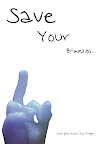
it's really hard to say too much about the card because i drew inspiration from some very very personal matters. i'll try to share as much as i can. let's go chronologically.


started off first because a dear friend of mine received some psycho letters. i wish i had scanned in the letter but she almost burned it the moment she got them. (in all honesty who wouldn't ya?

so anyway that's how my first card came out, wanted to use very black and red themes instead of the usual red, pink and white. so this is what happened.

2208 - card assignment


the problem with this card was that it was very font dependent. thinking back i think my thought process was rather fixated on the fonts as well. the class gave really really really mixed comments, for the most part they were amused that i reused the rose from a previous assignment. and one thing i realised... no point criticising your own work during presentation, after that people just don't feel like giving good comments. i really think in order to get good feedback from people in class, you have to feel like you love the work. maybe then people will put in more effort in saying what they mean as well - knowing you'll do something about that work.

my conclusion from class presentation? redo. which i did.

CHAPTER II: Child Like Love


i was inspired quite abit by Sham's work after his presentation in class. i liked how he presented love as a sunrise/sunset.

i'm not sure is he got how implicative his work actually is, but i really feel it's potentially very deep if his work was further elaborated on. I'll just put his link/work here for credit sake.

http://www.sham2208.blogspot.com/

what started off as inspiration from sham's work became my eventual card. now how it went from that to this is where it gets rather private.

2208 - Card Assignment (rework)


i really wanted to express a different kind of love and i kind of searched around for it ever since that class. it came really really late in some tough times with a friend and spending alot of time around my muse. eventually i got to experience a kind of love that's very akin to perhaps children holding hands... or siblings in younger days.

well i know all that seems kinda missing alot of details cos it is. but point is.... i was trying to express a very innocent, child-like kind of love. hence the use of natural colors, an overall very eartly-brownish tone to the card. i was trying to give the feeling it was like two children in a deserted field.

the only exception to the color scheme was the two characters in the poster. i changed the color scheme for them largely to bring them out. so while skin tone follows the rather earthly-brownish color scheme, the white represents very pure and innocent love. the red however represents a deep, innate passion that really is the motivation for both characters.

the card is a "flip up" card that really was designed to throw a person off when he/she first looks at it. (as in at first glance the cover page really doesn't look like a love card) it's only when the card is opened the full message is received.

some credits:

  1. thanks to my brother kayvern for the characters. my previous characters looks better for the psycho card. so kav here saved my ass by doing an outline for me. thanks again brother.
  2. thanks to john legend. no he didn't actually write the words or anything, but the words and a big part of the idea for the card came from my misinterpretation of some lyrics of his song "high"
  3. thanks to my muse
  4. thanks to my best friend, for everything

Monday, April 16, 2007

rework of 10 pictures assignment

ok last 10 pictures assignment was a disaster. common comments for the previous assignment were..... "it's not very clear" "i can't tell without the text" "why's the rose a different color"

well my conclusion were the following
  1. Don't choose complicated ideas, I'm not that power with design yet.
  2. Photos are supposed to be readable WITHOUT text. (stupid mistake to make really.)
  3. if i even suspect an idea's stupid. it's more than likely....... stupid.
so with that in mind i scripted another story altogether. my mind started working after passing through a parade of annoying secondary school kids asking for money. the idea solidified when i read about the Durai case again.

i don't think i'll reveal the script before the pictures. i'll put them in the comments after this post. some concerns i had
  1. do i need to put in background? i'm considering cropping the characters and putting them in appropriate backgrounds
  2. is the story clear enough?
10 pictures assignment

Monday, February 12, 2007

Assignment 4

A real challenge again, but the process was very rewarding. I was mulling about a good story board for almost a week before I began (So as always this is rather 11th hour work), I finally fixed an a piece of poetry I wrote quite some years back. I gave it the title "Do you want to take a picture", stole the title actually from a song (artist slipped my mind).

Mentioned all that because I thought it was rather ironic I'm doing a photo-story thingy with that same work. In any case I won't say too much, right now it's still rather raw. I'm going to retake the last few shots with a withering red rose again and I'm finding some way to put in text IN the picture itself.

I'm mulling how to "engrave words" onto the rock itself. The rest I figure I'll make words flow along the stalk/rock or "grow" from the grass. All that is testing my photoshop skills. Which I'm leaving to lab on Friday.

Flashy Cars

So it's been awhile since the last update. Work's been going on but I haven't got to logging them down.

Assn 3 (pictures later) turned out to be quite a disaster. Started out with the Roman Centurion helmet (see left): The plan was to draw a side profile silhouette of the helmet, all the while slowly removing the ornate details.

I'll put in the process pictures later, but what I ended up with was a really ugly drawing of a helmet. A couple of things were attempted to salvage the situation:
  1. Removing the "Mohawk"
    1. This resulted in a really plain looking helmet. (which was still ugly)
  2. Removing the helmet proper
    1. Which resulted in a red Indian like thing.
From 2208 Assn 3


Neither of it worked, until I had a little brain wave. I'm going to attempt to trace it:
Roman Centurion Helmet > Romans > Fighting with Greeks > Greek Spartan Hoplite > Hoplite Helmet
Ok this is where it gets really tricky, for some reason I got fixated with the front profile of the Spartan Hoplite Helmet. (I think watching Troy had something to do with this) So my mind jumped from Hoplite Helmet to my final symbol which is based on negative space.

So at first glance it looks like some strange plant (or something phallic) but it actually makes use of the paper to frame a Spartan Hoplite Helmet


From 2208 Assn 3
Now the problem with all that? I can't really trace my thoughts on this project. Which was harder than I had expected. Design wise maybe I'll never really be with the best of them with drawing and photoshop skills, but still I think I need to get my mind around this design thing.

That mulling aside, what I'm going to do is that I'm going to take a picture of a fully armed Spartan Hoplite (So I have more details to distill) and hopefully I'll have an iconic design ready soon. The symbolic will stay I guess, unfortunately I really do like it alot. So i'll break the rules this once (again).

Looking further ahead, I did mention I was going to redo assn 1. What I'm going to do is replace the tao gei with Hoplites in various battle formations. It's going to be rather complicated to draw, but we'll see how it goes.


Friday, February 2, 2007

LAB

you know you figure they could teach you stuff in the labs sooner. labs always make me feel like i was painting with a chisel just a couple of days earlier.