Friday, April 20, 2007

timmy and the blue beanie

so finally. the big one.

it started off strangely enough... our group had 4 people. i was already a team with pegan. then we were trying to pull kayvern into the fray. then fransca came along cos she was with kayvern. all in all... rather amusing.

in any case... the first presentation we did using kayvern's fly story and pegan's nursery rhyme.

http://kayv-man.blogspot.com/2007/04/re-god-created-fly-but-he-forgotten-why_3188.html

both of which were not exactly very well received so we all did a brainstorm again, i had the opportunity to re-sell my ideas again. i had created two story boards. not very good with drawing so i ended up writing both out instead. in any case the group really liked my second story (the other one being meant for children and was really graphics intensive and hardly even logical) and we haven't looked back since.

Timmy - Storyboard + Flips


the story took a great deal of time and effort to write (and re-write; there were almost 7 ammendments to it)... and i have to thank pegan for helping me with some of the harder rhymes. (this was after siti pointed out some lines needed re-rhyming)

the main idea of this idea (Timmy and the blue beanie) was for the story to have one meaning for the children (which was highly visual and simple in nature) and a much deeper reflective tone for adults. i wanted to encompass all the ideas into a poem: i fixed the number of syllables in each line and i made sure each stanze was really short. in the end each stanza had only three lines and the third line being dedicated to the adults.

the hardest part of writing this story was in building the double story... the problem got compounded when we all decided to do flips ups for the book. kayvern and i spent quite a few hours just conceptualizing the entire book.

once the photoshop and illustrator got started, I took up all other tasks other than the graphics because I really still am quite a retard with those programs. (not to mention my eye for color still isn't exactly up to scratch) in any case i started work on the grid and design document.

Timmy Design Doc


i had the idea to combine the grid with the rule of thirds principle - which later became one of those ideas i should have kept my mouth shut about because it became really hard to accomplish. in any case this grid that we ended up using is special because while foreground characters tried as much as possible to align with the rule of third (already measured out in the grid) the text would follow traditional layout rules of the grid as stated in the lecture.

furthermore our decision to join grid and rule of third actually meant we had to separate words and pictures. our eventual decision to put both together made producing the design document all the harder.

kayvern and i also spent quite some time putting in elements of the golden ratio into the book, the paper is actually scaled down from an A4. while original intentions were to make the book flip in the center, last minute changes to make it flip by the edge not only made the book simpler to produce but allowed the golden ratio proportions to show better as well.

http://kayv-man.blogspot.com/2007/04/timmy-and-blue-beanie.html

power points

not much to say about the gestalt. but the slides are put up here anyway. i'll like to say that without the animation it really is quite boring. animating the entire thing took me and prawn (pegan) a hell of alot of time. this assignment was tough in its own way.

2208 - Gestalt ppt


the initial one we used a different poster which we thought failed all principles of gestalt, color and all that stuff. in the end. cheryl wanted the A3 that i printed. and as Liting said, i think that says alot.

re work of my name is

not much to say for this one. just followed comments given by class. P was fixed along with the O.


-----------------------------------------------------------

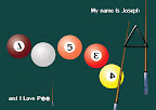
now as for this one. the idea hit me like a train when i was ironically.... on a bus. about... two days before submission, still needed something to replace tao gei. drawing out the spartan for the abstraction assignment quite nearly killed me and i wasn't going to draw another 5 or 6 of them to make my name.

tried to do one with wonders of the world. kinda got stuck at the first letter. i had O and E to be done by stonehenge, great wall to do S, the back view of statue of liberty to be my P and the Petronas Towers to be my H. My J was the statue of Jesus in Rio de Genaro, the shadow was supposed to form the "tail" of the J. couldn't do the shadow despite about half a day with photoshop. in the end again my muse saved me by reminding me i loved pool a whole lot in my younger days (even now, but there's just so much less time for it)


the first two hours i spent orienteering the the numbers to form my name. got stuck with O and H until it suddenly struck me that i had not used the cue ball, cue sticks and the triangle "set".

now the "P" initially was a 1 flipped over. then my best friend reminded me 4 looks more like a P upside down (which was very true, and made me feel kinda stupid for spending an hour going through all the fonts to find sth that looks like an upside down P.......) so here's my thanks to both xq and michelle!!

the matrix reloaded

the reduction/abstraction thing was finally re done. i completely traced out a picture of a spartan soldier from the web. slowly brought the thing down until the final abstraction, symbol could be seen.

2208 - Abstraction


i'll give a small running commentary
  1. spartan soldier in action
  2. converted spartan soldier into digital version, using cleaner and simpler lines and took away all shading. leave only simple colors which were consistence throughout character
  3. took away details like arrows on shield and sheath (which doesn't look like a sheath anyway)
  4. took away limbs because i felt accessories afforded the character enough closure
  5. moved focus to upper body by removing leggings
  6. removed upper body
  7. upper body accessories
  8. removed front of cape (i realised it really made no difference to the entire picture. with our without the front of the cape)
  9. next to go was the face inside the helmet
  10. cape
  11. sword and bracer
  12. shield
  13. "hair" on helmet
and finally it becomes...


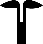
i was having a little discussion with kayvern over whether the final stage was a symbolic or indexic representation. I'm more inclined to say indexic actually, it's still in reference to a spartan soldier. considering all other ancient war helmets of the time really did have different silhouettes.

just to make it clear to anyone who still doesn't get the final stage, it's a reverse of the spartan helmet - making use of negative space to frame the helmet instead.

look here.... no smoking.

poster was the only project to go quite smoothly without a hitch. (printing did give me quite a fair bit of problems though)

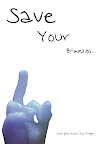
i started off without any ideas at all. so i started taking pictures. lots of them. most of them didn't make any sense. i guess you can sorta see i had a little frame in my head and i was trying to throw things in. in the end it was the random thing that helped.

Shoot 1 2208

in the end something about that finger statue/bust inspired me. and this came out:


in the end a little tweaking here and there and i ended up with final product....


by and large the class liked it without much negative comments. which was a first. very special man, as with all first times ;)

cardy thingy

it's really hard to say too much about the card because i drew inspiration from some very very personal matters. i'll try to share as much as i can. let's go chronologically.


started off first because a dear friend of mine received some psycho letters. i wish i had scanned in the letter but she almost burned it the moment she got them. (in all honesty who wouldn't ya?

so anyway that's how my first card came out, wanted to use very black and red themes instead of the usual red, pink and white. so this is what happened.

2208 - card assignment


the problem with this card was that it was very font dependent. thinking back i think my thought process was rather fixated on the fonts as well. the class gave really really really mixed comments, for the most part they were amused that i reused the rose from a previous assignment. and one thing i realised... no point criticising your own work during presentation, after that people just don't feel like giving good comments. i really think in order to get good feedback from people in class, you have to feel like you love the work. maybe then people will put in more effort in saying what they mean as well - knowing you'll do something about that work.

my conclusion from class presentation? redo. which i did.

CHAPTER II: Child Like Love


i was inspired quite abit by Sham's work after his presentation in class. i liked how he presented love as a sunrise/sunset.

i'm not sure is he got how implicative his work actually is, but i really feel it's potentially very deep if his work was further elaborated on. I'll just put his link/work here for credit sake.

http://www.sham2208.blogspot.com/

what started off as inspiration from sham's work became my eventual card. now how it went from that to this is where it gets rather private.

2208 - Card Assignment (rework)


i really wanted to express a different kind of love and i kind of searched around for it ever since that class. it came really really late in some tough times with a friend and spending alot of time around my muse. eventually i got to experience a kind of love that's very akin to perhaps children holding hands... or siblings in younger days.

well i know all that seems kinda missing alot of details cos it is. but point is.... i was trying to express a very innocent, child-like kind of love. hence the use of natural colors, an overall very eartly-brownish tone to the card. i was trying to give the feeling it was like two children in a deserted field.

the only exception to the color scheme was the two characters in the poster. i changed the color scheme for them largely to bring them out. so while skin tone follows the rather earthly-brownish color scheme, the white represents very pure and innocent love. the red however represents a deep, innate passion that really is the motivation for both characters.

the card is a "flip up" card that really was designed to throw a person off when he/she first looks at it. (as in at first glance the cover page really doesn't look like a love card) it's only when the card is opened the full message is received.

some credits:

  1. thanks to my brother kayvern for the characters. my previous characters looks better for the psycho card. so kav here saved my ass by doing an outline for me. thanks again brother.
  2. thanks to john legend. no he didn't actually write the words or anything, but the words and a big part of the idea for the card came from my misinterpretation of some lyrics of his song "high"
  3. thanks to my muse
  4. thanks to my best friend, for everything

Monday, April 16, 2007

rework of 10 pictures assignment

ok last 10 pictures assignment was a disaster. common comments for the previous assignment were..... "it's not very clear" "i can't tell without the text" "why's the rose a different color"

well my conclusion were the following
  1. Don't choose complicated ideas, I'm not that power with design yet.
  2. Photos are supposed to be readable WITHOUT text. (stupid mistake to make really.)
  3. if i even suspect an idea's stupid. it's more than likely....... stupid.
so with that in mind i scripted another story altogether. my mind started working after passing through a parade of annoying secondary school kids asking for money. the idea solidified when i read about the Durai case again.

i don't think i'll reveal the script before the pictures. i'll put them in the comments after this post. some concerns i had
  1. do i need to put in background? i'm considering cropping the characters and putting them in appropriate backgrounds
  2. is the story clear enough?
10 pictures assignment